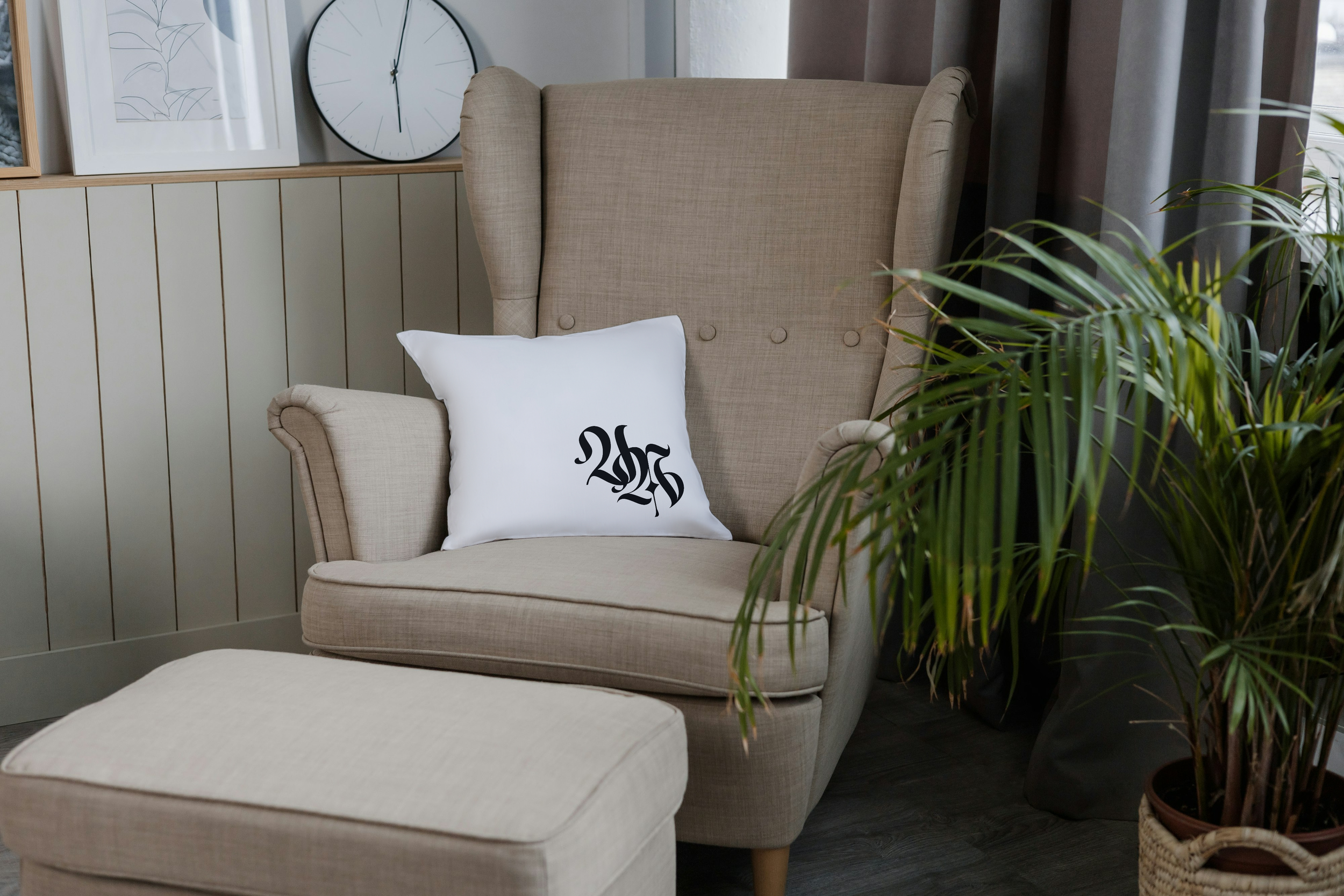
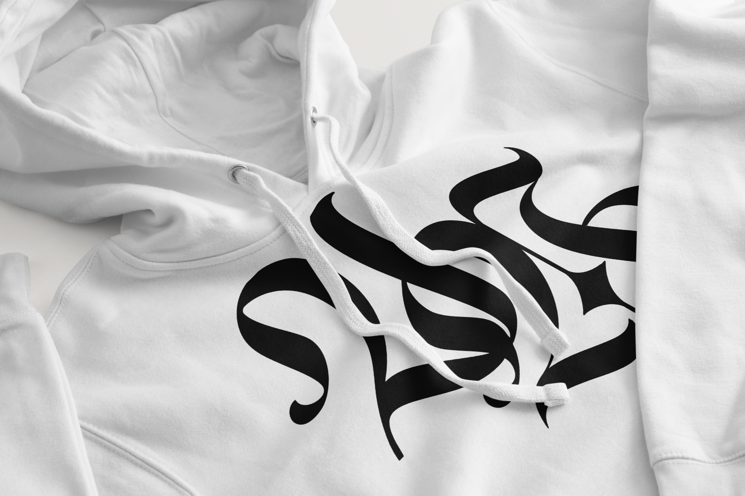
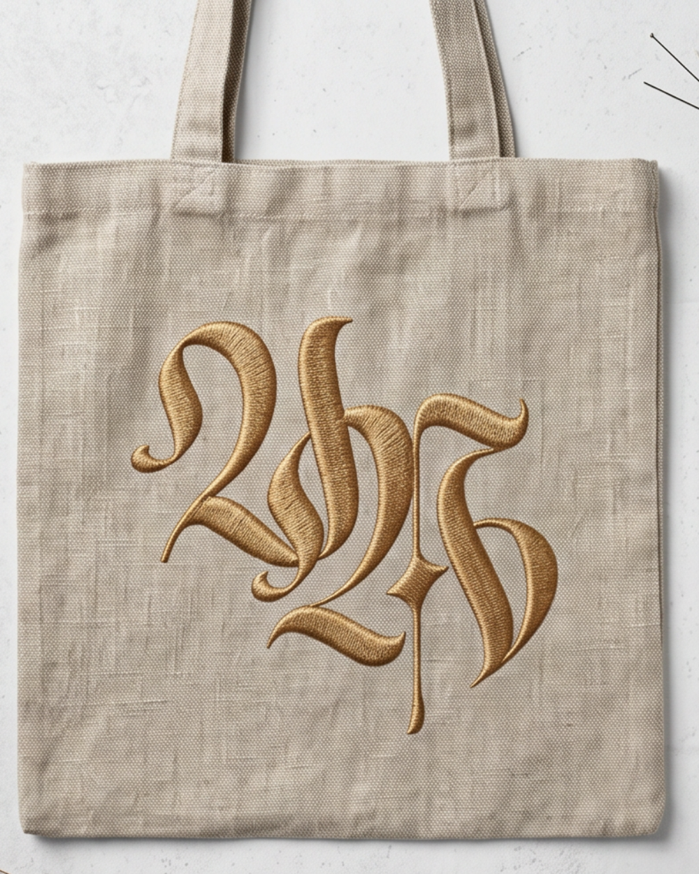
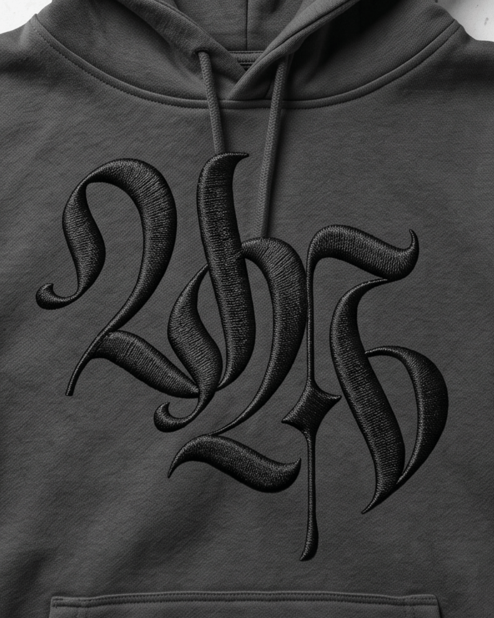
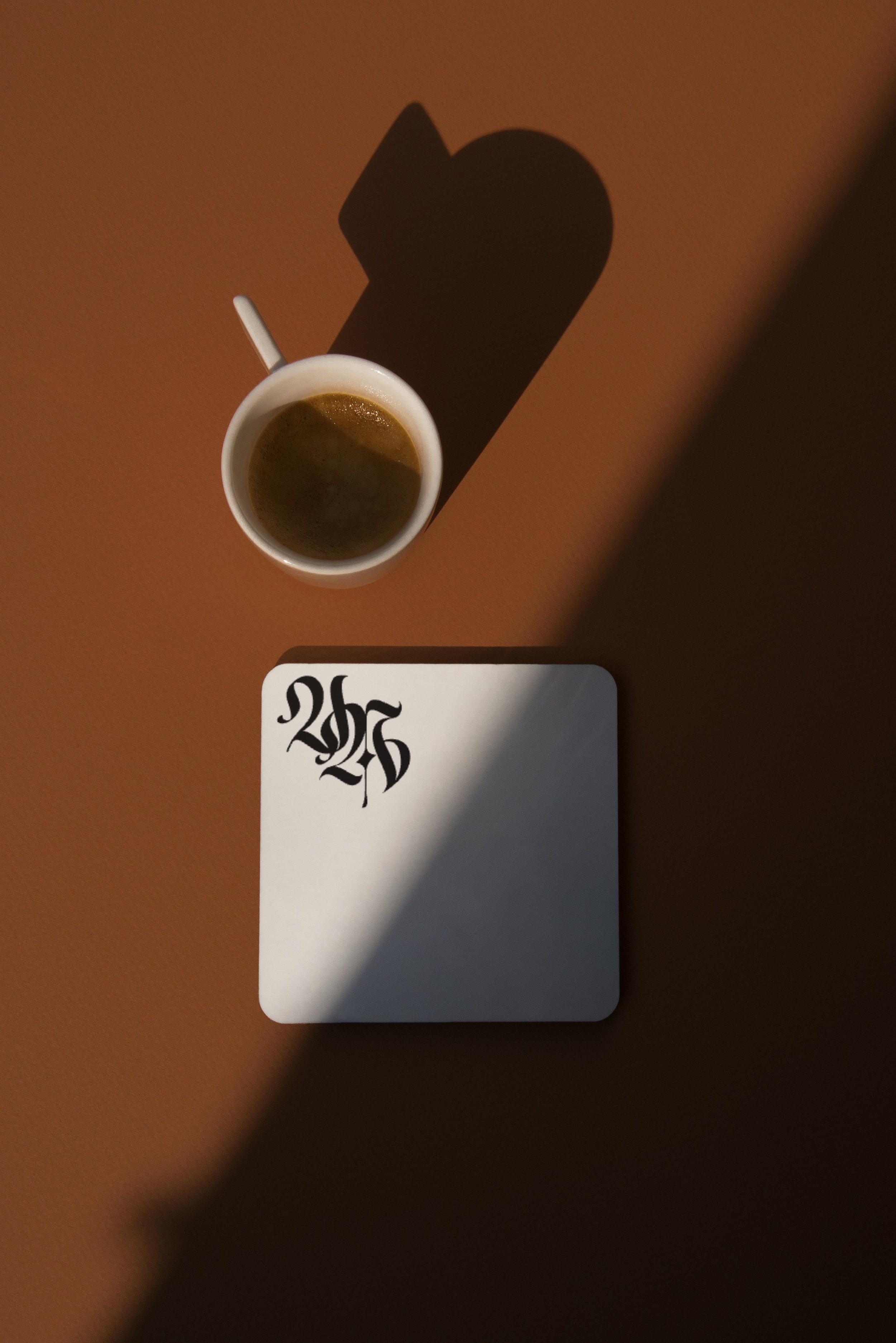
VA Blackletter Monogram
–
VA Blackletter Monogram –
Built from scratch using blackletter tradition as a structural foundation, the two letterforms are interlocked so completely that the mark reads as a single unified object rather than two initials placed side by side.


Concept
The central idea was interlocking two letterforms so thoroughly woven together that neither could exist without the other. This mirrored the nature of a personal monogram itself, where name and identity become inseparable. Blackletter was chosen as the structural foundation not for nostalgia or decoration, but because the tradition demands a level of stroke discipline and spatial precision that generic display typefaces cannot provide. Blackletter construction forces the designer to think in terms of pen angle, thick-thin contrast, and the relationship between positive form and negative counterspace.
Outcome and Application
The resulting mark is legible at business card scale, holds integrity as an embossed or engraved element, and carries enough visual weight to function as a standalone graphic at large sizes. It was applied across a stationery system including business card, letterhead, and product packaging, demonstrating that a well-constructed monogram can anchor an entire identity without requiring a supporting wordmark.
Construction
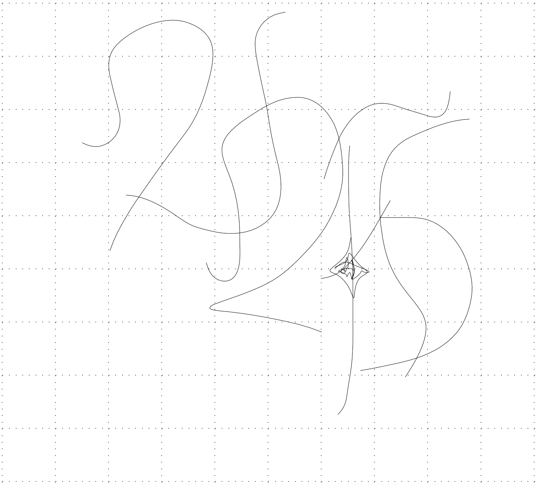
The letterforms were built from scratch rather than adapted from existing typefaces. Beginning with the blackletter skeleton - the underlying calligraphic armature that governs stroke direction and weight distribution - each letter was developed independently before being resolved into a single unified composition. The V and A share structural elements where their forms overlap, meaning the eye can read the composition multiple ways: as a V containing an A, as an A emerging from a V, or simply as an interlocked monogram. This ambiguity is intentional and gives the mark visual depth that rewards closer inspection.
Maintaining consistent thick-thin stroke contrast across the interlocking zones was the primary technical challenge. Where two strokes cross, the contrast hierarchy had to be resolved carefully so neither letter visually dominates. The negative space cuts; the counters and voids between and within the letterforms, were as deliberately shaped as the positive strokes themselves, functioning as a compositional element rather than leftover space.

