


Concept
The Studio8 identity was developed around the idea of flow, continuity, and public interaction. The central form originates from the number 8, rotated horizontally and divided into two interlocking segments to create a diagonal “S” . This transformation allows the mark to function simultaneously as a symbol, a letterform, and a spatial gesture. Rather than relying on decorative elements, the identity uses reduction and repetition to communicate movement in its simplest form.
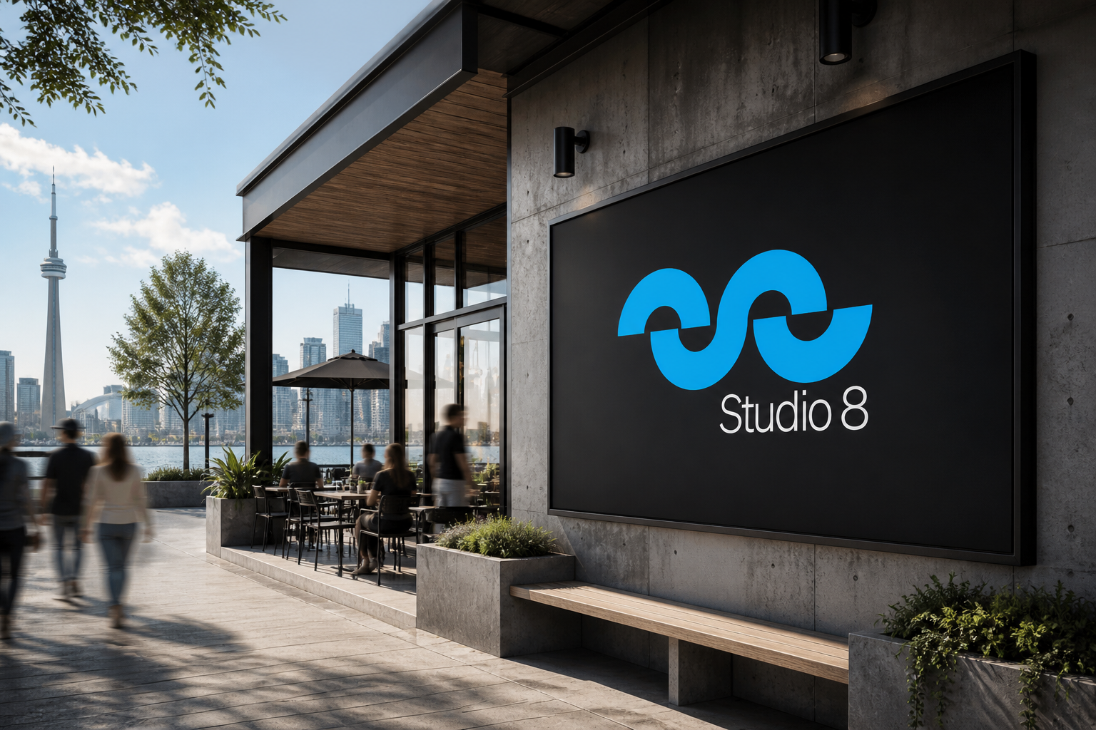
The geometry draws inspiration from the Toronto waterfront itself. The curved forms echo the motion of waves along the shoreline while also referencing audio waveforms generated through music, live events, and public performance. This dual reading was intentional. Studio8 exists as a civic and cultural destination, so the logo needed to represent both physical place and shared experience. The symbol shifts between interpretations depending on scale and context, reading as an abstract waveform from a distance while revealing the hidden “S” and split “8” upon closer inspection.